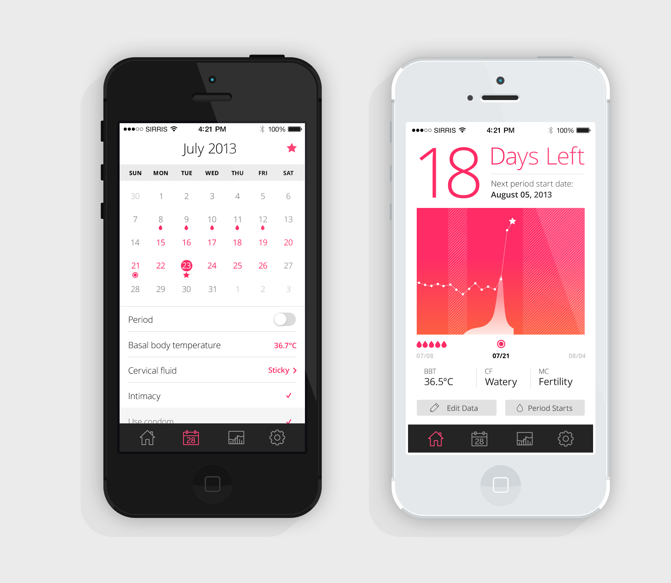
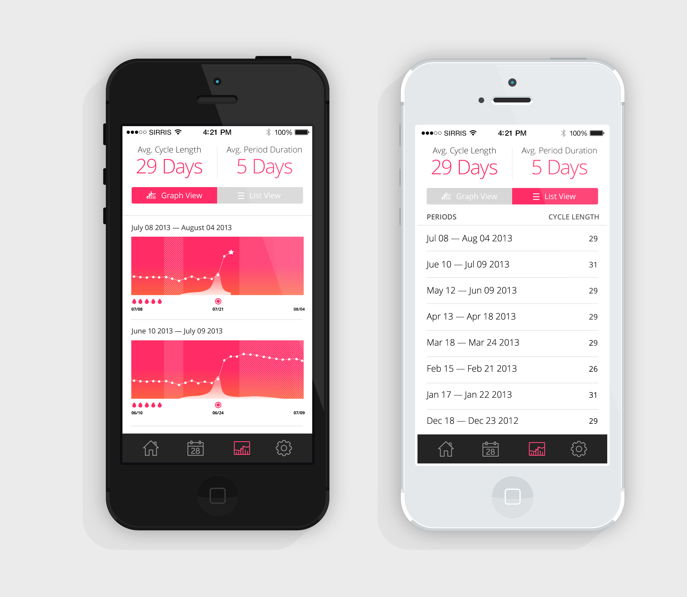
Period Tracking App Concept
The goal was to design a new menstrual cycle tracking mobile app that looked professional, creates a positive feeling of being credible and reliable, and that women can relate to. We wanted to make sure that it does not make users feel that period tracking is a chore, but instead inputting their info is beneficial for their health and that they are taken care of.
Design Benedict saw an opportunity for improvement in the current market. After a survey research analysis in a pool of their target market and a competitive analysis of existing apps, we decided that we want to design an app that focuses on its core functionalities, simplicity in design and an intuitive UX to offer a refreshing experience during those important days of the month.
Leveraging previous experiences of working with mobile apps, we wanted to make sure we’re working in a realistic and feasible way. We had an information architecture, we built the wireframes, we worked out the four different modes (simple, conception, contraception, pregnancy)…we had it designed down to the specifics in its Settings page and if it’s a slide or a pinch with your fingers. We didn’t forget to consult a team of developers along the way. Then we put a face on it, and that’s how the interface got to look like how it looks like today.

