Design Benedict
Design Benedict (DB) is a design team made up of a communication designer, an interaction designer, and an account/project manager. The team shares the core values of creating pure, simple, and straight-to-the-point design that eliminates all the unnecessary elements, and leaves space for the users for an enhanced user experience. They aim at fulfilling the emotional needs of users by adding human touch and creating small moments of charm.
The team’s philosophy is derived from the analogy to the popular breakfast dish, eggs Benedict, where they take its pure and organic main component – the eggs, add skills, techniques, and finesse, with the perfect balance of ingredients and flavours, to create the perfect breakfast experience. They strive to do just that – taking something so ordinary and approachable to anyone, like “breakfast”, but adding design and fine-tuning it to create a good user experience.
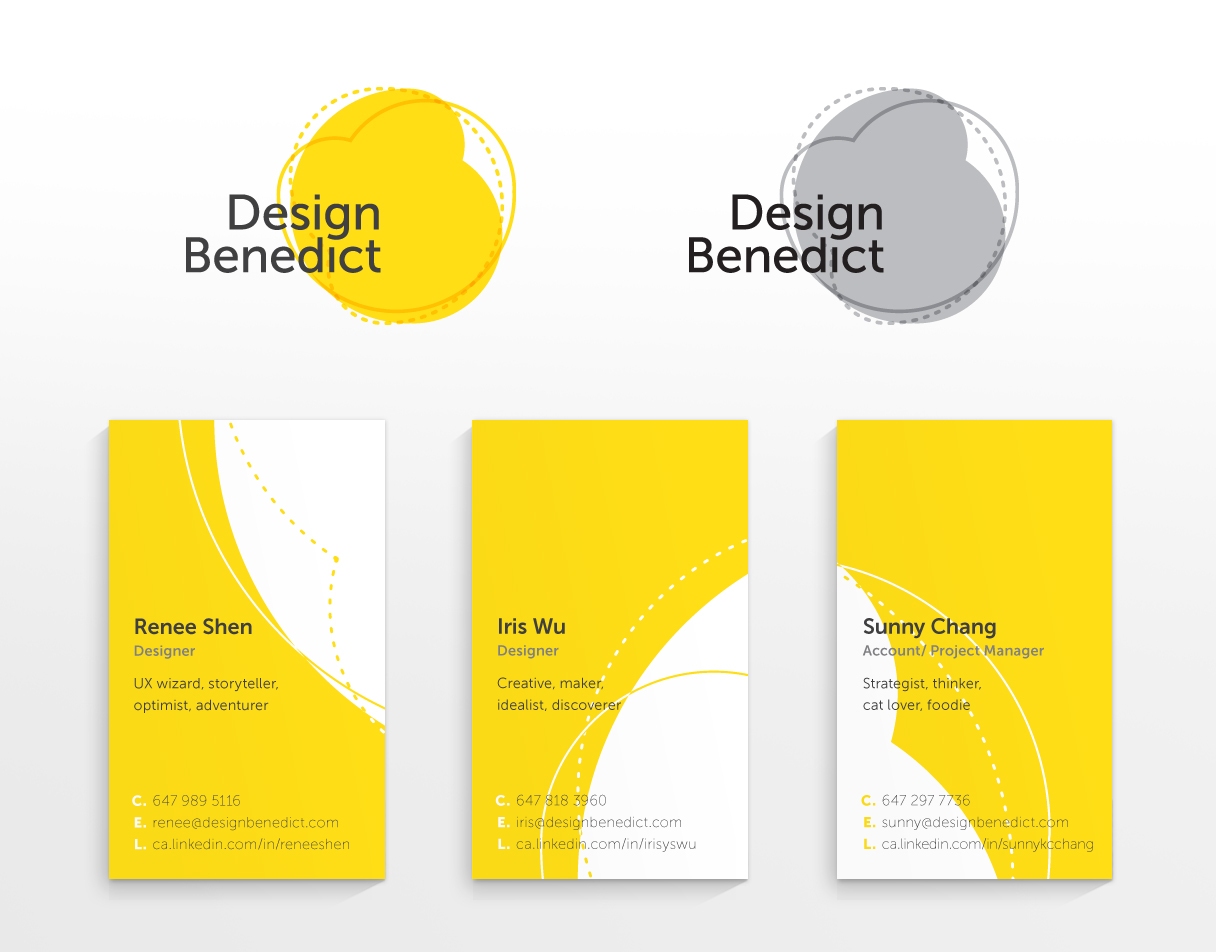
The DB logo represents the team’s belief in a collaborative and iterative design process. The dotted line symbolizes the starting point of various concepts and ideas. The solid line shows that connection has been formed. And the solid shape indicates the creative/design solution.
Those 3 graphics overlap in an organic way – We allow the designs to happen with that flow of inspired effort, rather than forcing it.
Allowing our creativity to flow freely without being hampered in any way by our usual processes. Unplugging from these routines and venturing off-topic might be the best way to allow our minds to organically find their way to the design we were looking for in the first place.